A better Way-finding in Software with Visual Loudness
Why do you need loudness?
Software in 21st century doesn't come with user manuals. They are most likely self installed on a mobile device. Nobody teaches how to operate an app.
Some apps just are just POP & provide natural way-finding. There is no art behind this, its just quantitative analysis. Loudness needs to be tuned across the interface to help the user navigate & take actions.
Loudness is in your head!
You don’t need to make noise(literally) to be heard. You can visually evoke loudness in the mind. Colours, contrast, position & motion help digital interfaces communicate loudness. The craft is to understand how to weigh this loudness & set the nudges for the user across the interface.

Colours play a very important role in adding visual loudness naturally. In general warm colours are used infrequently which stands out among other cooler colours. Position as well matters. The corners are usual suspects for primary actions & often louder places. To go one step ahead, a little animation can lift the loudness to the next level. These techniques can be built into systems through the use of links, buttons, & promotional call-outs.

You need a scale to measure
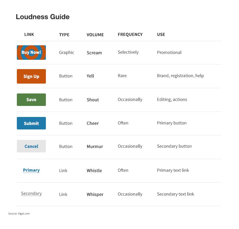
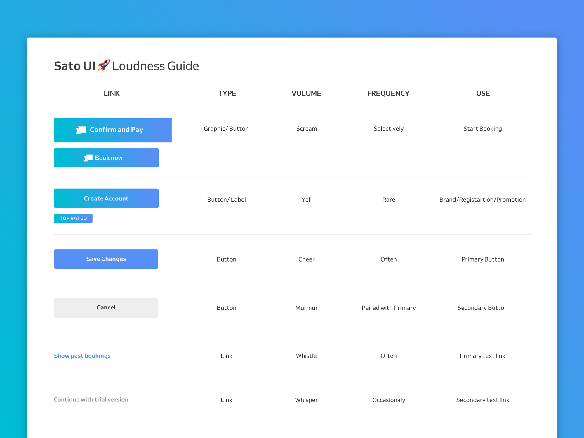
Visual loudness without a scale can be disastrous. Any quantitative analysis needs a scale to measure. For visual loudness, there are no standard but there are suggested techniques & parameters on which you can build your own loudness scale. You can classify components in terms of volume, frequency & use. Volume can be . Frequency can determine if the volume assigned is appropriate, you don’t want a lot of noise a more frequently appearing component. The Use is more suggestive of justification for the cost of volume.
A good example — A Confirmation Button can have very high volume given that frequency is low & the use is more encouraging . A bad example will be a Cancel Button with high volume -though the frequency is low, but the use is not encouraged (From the perspective of the Software designer).
Having a scale really helps in setting up the inventory of components used across & fix the volume to bring out the POP effect.

So next time you use your favourite app, try to intercept how well loudness has been tuned & observe how smartly the app nudges you to do what it wants you to.
Stay tuned & follow for more stories brewing just for software lovers ❤️.

 Go to App
 Subscribe

