 Go to App
 Subscribe

The deep rooted psychological experience of something as strangely familiar but not exactly the same - this uncanny territory - is something I've seen influence all kinds of aesthetics. For example, in typographic pairing...
Does this look like something out of a nightmare?
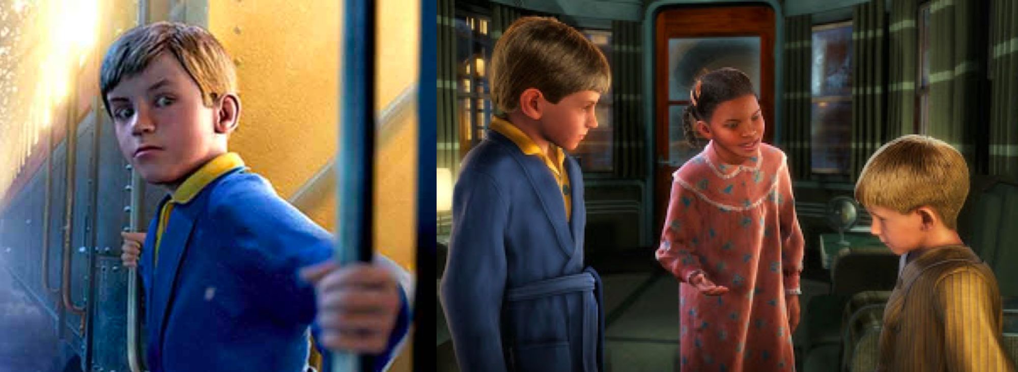
Possibly a haunted train transporting haunted children? - that's how the ten year old version of me interpreted this movie. Many years later I realised that The Polar Express was meant to be a joyful children's film about Christmas magic.
The music, the hot chocolate and the golden ticket were telling me that something positively magical was happening - but what I saw was telling me the opposite. It was a dance of conflicting perceptual cues. Why did it sound happy and look scary? Scary, strange, eerie, discomforting... the term we are looking for is uncanny.
The uncanny valley as a concept was identified by the robotics professor Masahiro Mori in 1970 to explain this very repulsion to something that is too close to looking like a human. We have empathy for objects that have human features but are recognisably different from us, but at the point when the object starts resembling humans too closely, but not exactly - a missing shine in the eye, or waxy skin - our empathy falls deeply.
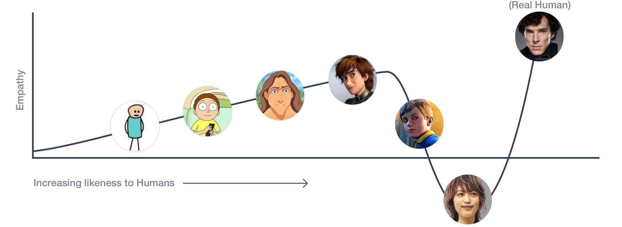
Masahiro's hypothesis was in the context of robotics and mapped our emotional response to the human likeness of robots, but this deep rooted psychological experience of something as strangely familiar but not exactly the same - this uncanny territory - is something I've seen influence all kinds of aesthetic choices in smaller degrees - for example, in typographic pairing.
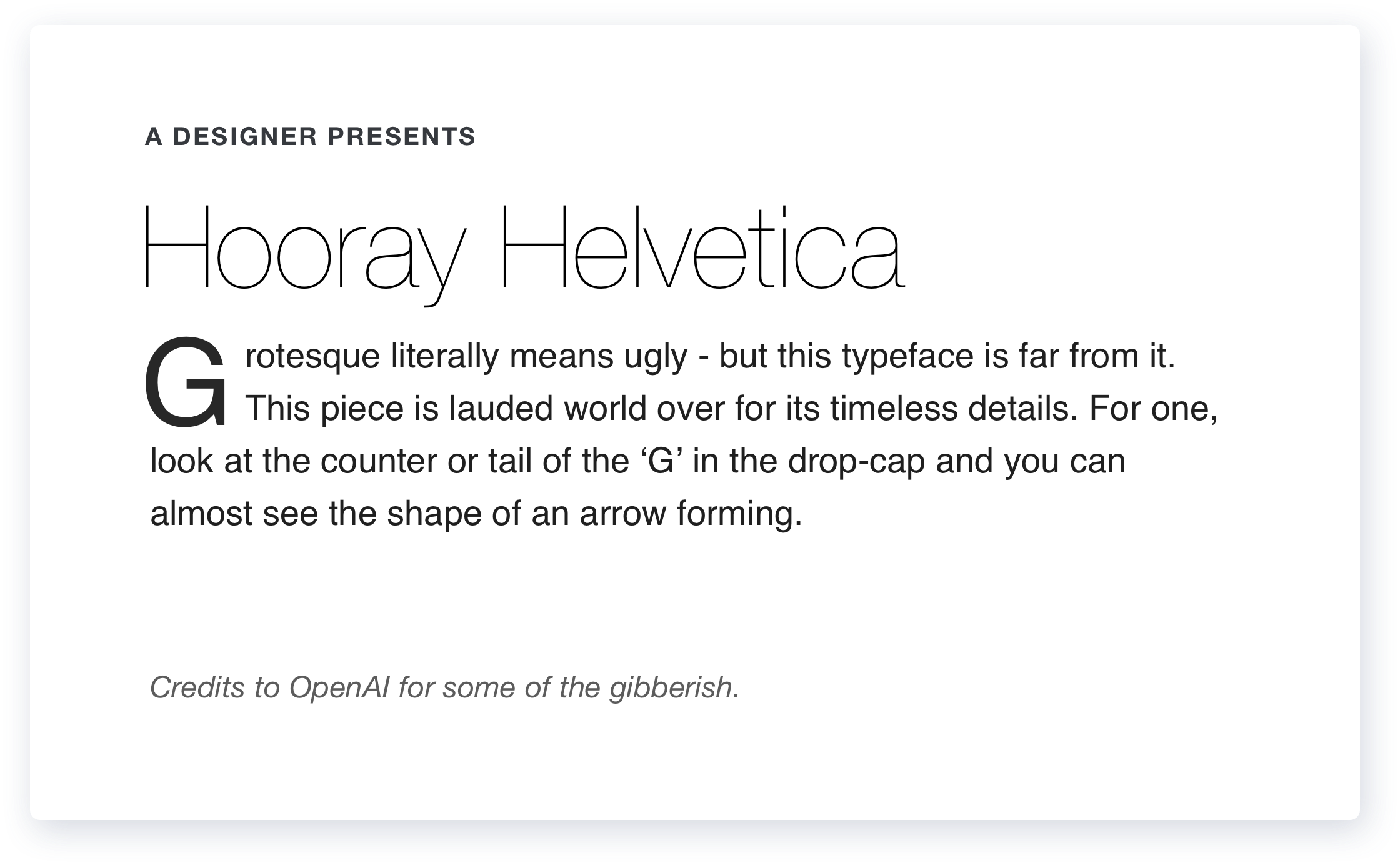
One way to create interest in our typographic compositions is to pair multiple typefaces that look good together - and a simple rule in pairing is to pick typefaces that are different enough from each other that they bring contrast. When we use two typefaces that are too similar - we find ourselves in the uncanny territory - the eerie feeling that something is wrong - and I'm going to demonstrate what that really means by creating pairs for a popular typeface - the neo-grotesque and gorgeous Helvetica.
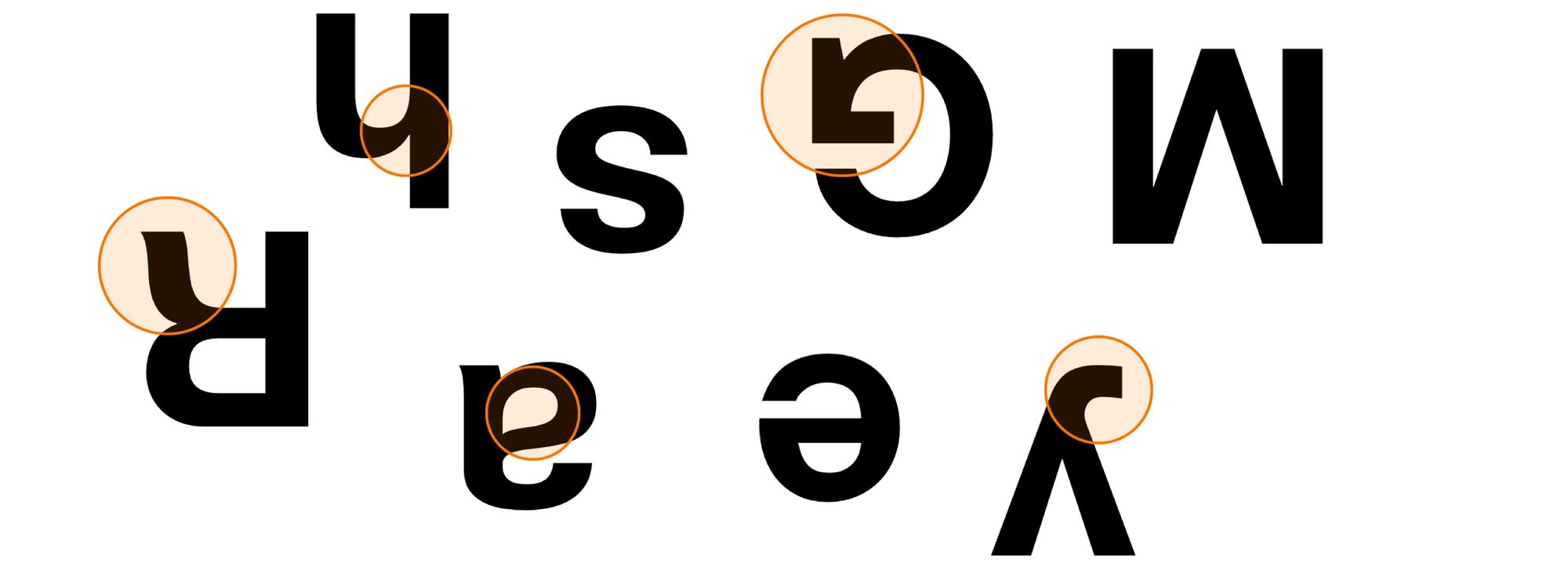
In typography, as in music and art, we get better when we sensitise ourselves to the differences between two notes, two fonts, two forms. Before we start, let's familiarise ourselves with some visual characteristics of Helvetica - ear, cheeks, shoulder, et all.
I'm going to compose some text blocks with Helvetica adorning the body text. Each of the following typefaces, one by one, will be used for the headings. I've picked out typefaces that are of varying degrees of resemblance to Helvetica - and we will start with the one on the extreme left - the typeface that is the most different.
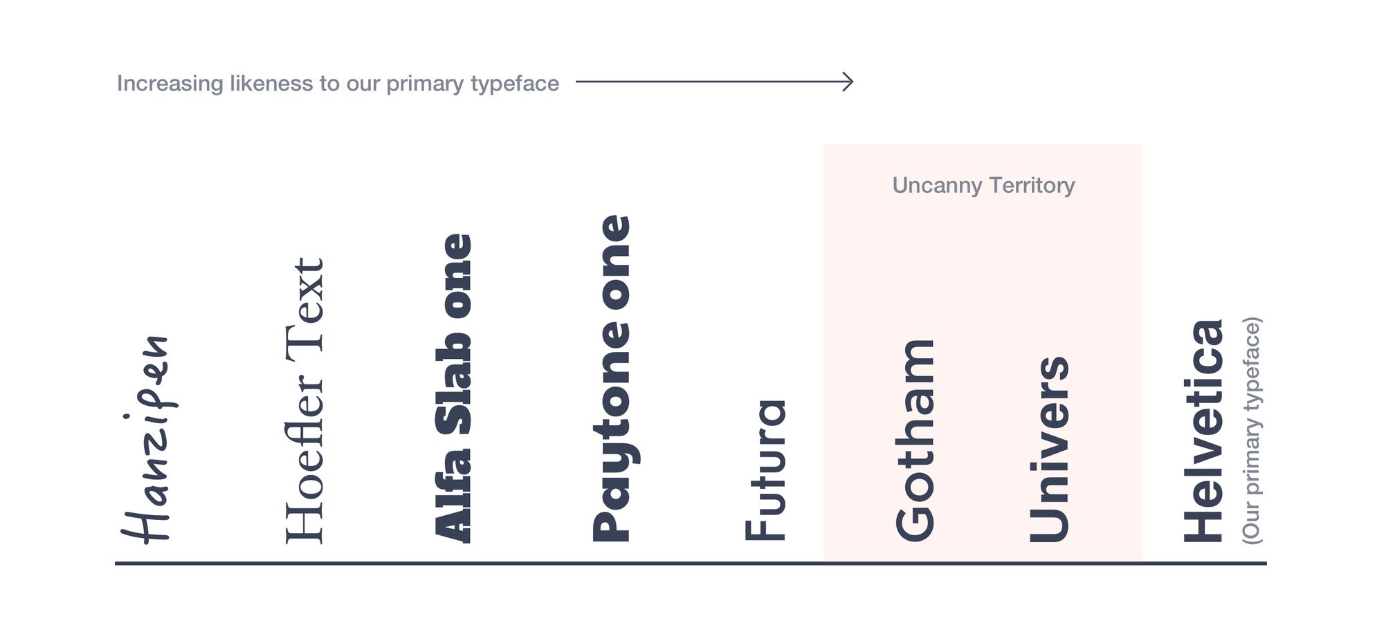
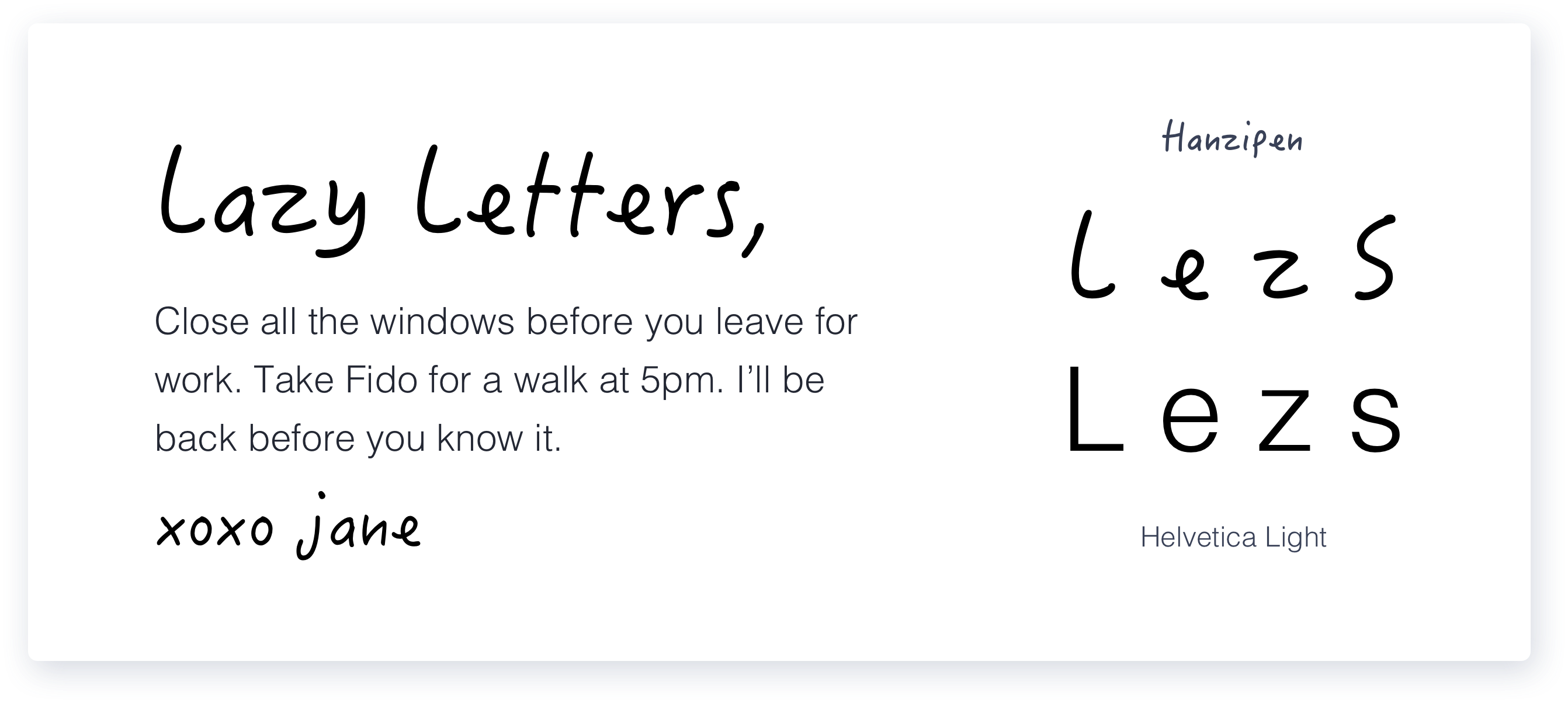
Hanzipen - A Handwriting typeface
Handwriting fonts are clearly so different from 'font-like' fonts that they will almost always provide contrast. Challenges here are mostly around legibility and appropriateness of mood. Overall, a safe pairing.
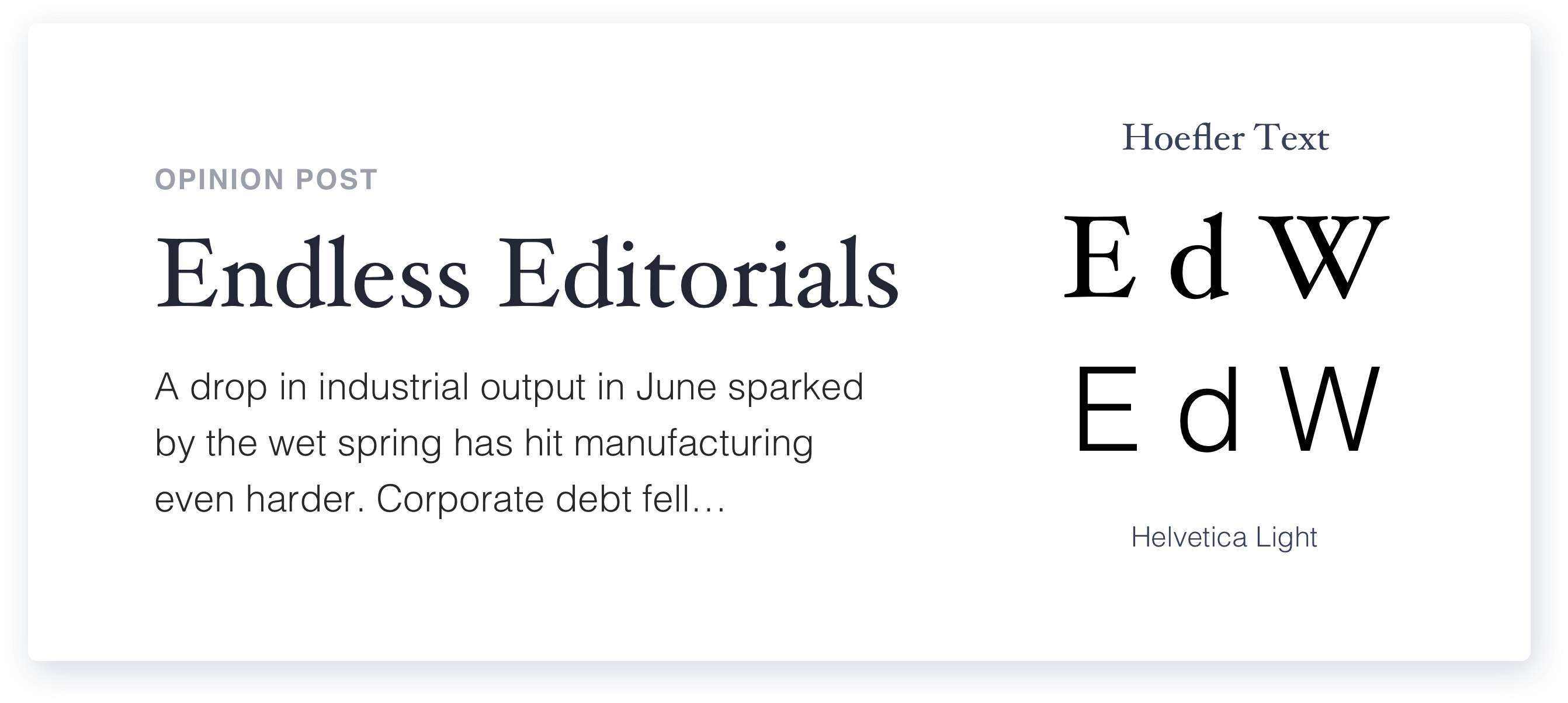
Hoefler Text - A Serif typeface
Here I've picked an old-style serif typeface. Notice how some strokes are thin, some are thick - in contrast to Helvetica where all strokes are (almost) the same thickness. These traits make it significantly different from Helvetica - more than enough contrast to be a safe pairing.
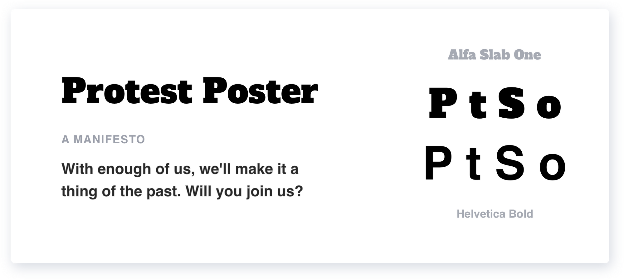
Alfa Slab One - A Slab-Serif typeface
Slab serifs as the name suggests have bolder blocky slabs for the serifs/feet. These are usually thick fonts with tight counter-spaces that are in high contrast even to the boldest version of Helvetica - and where there is contrast, it is generally safe.
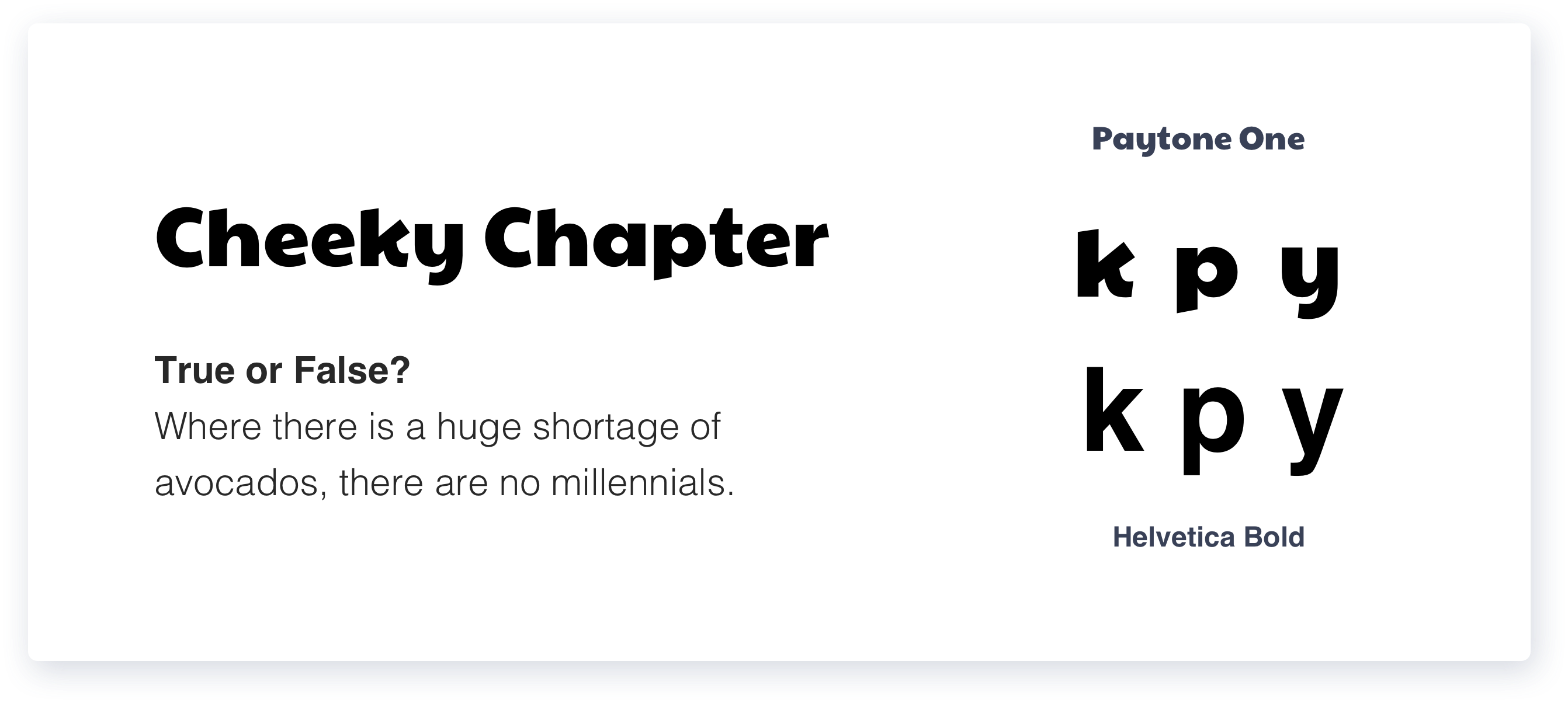
Paytone One - A Sans-Serif display typeface
As we move away from the serif typefaces and closer to Helvetica - pairing gets a little more difficult. Look for characteristic little details on display typefaces, like a curve on the k, an angle in the descender of the p - details that can be a distraction on body text and impact legibility, but are meant to add character to the headings. These details make Paytone one recognisably different from Helvetica, so it is definitely a safe pair.
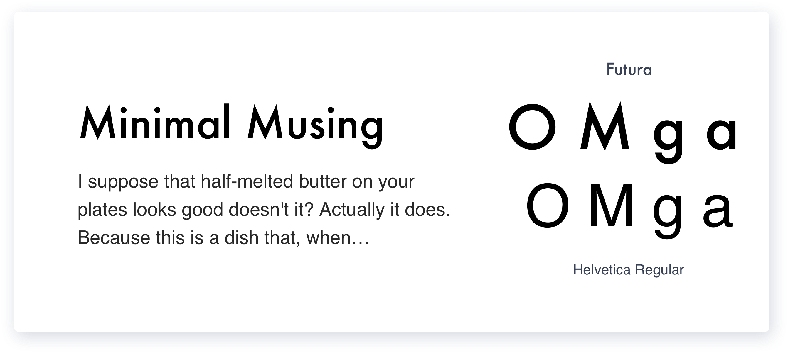
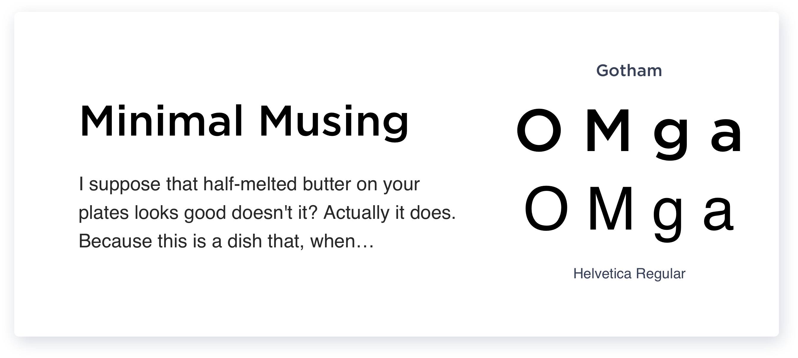
Futura, Gotham - Geometric Sans-Serifs
If you're just starting to train your eye on forms, here's where things start to get tough. Here we have Gotham and Futura - neutral typefaces like Helvetica that are different on few counts - for eg: the O's of Gotham and Futura are perfect circles in contrast to Helvetica's ovals. Futura can be carefully used as a pairing option, but Gotham on the other hand to an untrained eye can start to look similar to Helvetica.
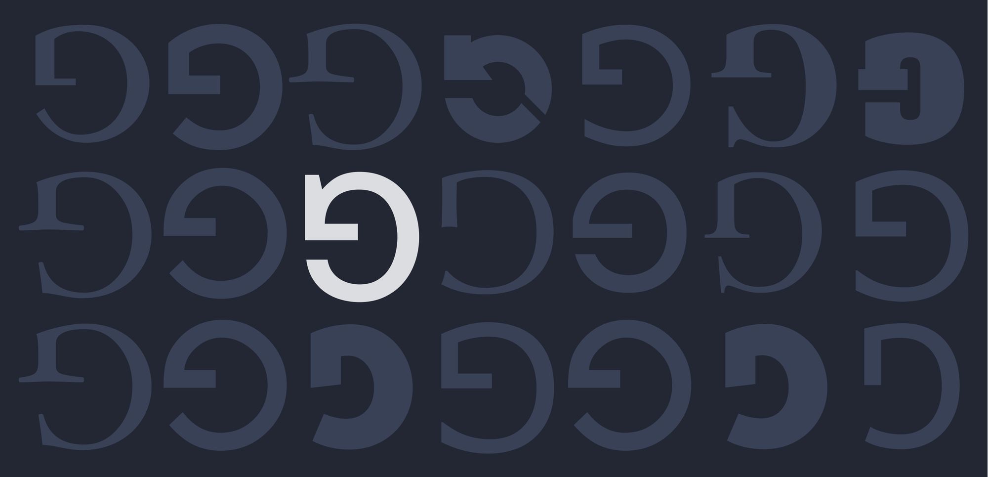
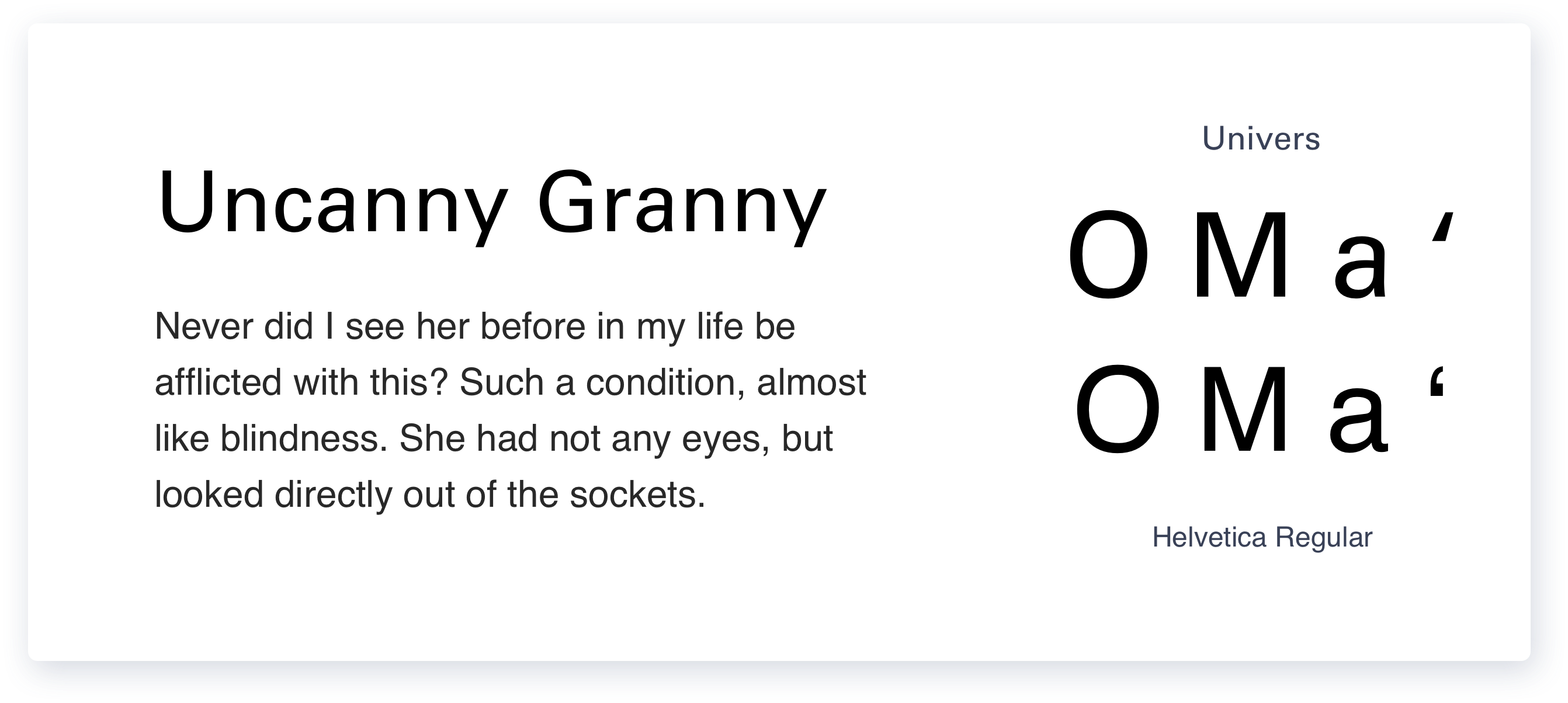
Univers - A Neo-grotesque like Helvetica
The risk we take when we use typefaces that are too similar but not the same is that when most forms look similar, a certain curve or a particular glyph that looks different can subconsciously start to feel like a mistake - evoking that eerie feeling.
Here's a typeface very similar to Helvetica - I've removed any play of weights to demonstrate that this is uncanny territory.
Using the Helvetica Family
You've seen how to avoid the uncanny by pairing typefaces that have enough counts of difference between them. But at the other end of the spectrum is the safest play, although not the most interesting - using fonts from the same family.
A lot of typefaces are designed with variants, not just the bold, light, italics - but also rounded, condensed, monospaced, and more - for varied uses. For eg: bilingual airport signs in Hindi and english will use the same typeface family for the two different scripts. The ear, spine, counters that make up the characters will be designed to look like they are of the same family.
By using fonts from the same family - we close the perceived gap entirely. The below is an example of how you can play around with a single typeface and still bring contrast to a composition - but that's for another day. Have fun pairing!