Users and their way of carrying out tasks vary to a great extent. Each with their own experiences and habits impacts how they perform tasks. You can bucket user needs and frustrations into personas but, behaviour sticks out like a sore thumb. Behaviour is individualistic. Intelligent interfaces should consider this. How can we design interfaces that adapt to changing behaviour? Such a system could address the particular needs or desires of individual users and discover opportunities to optimise their journeys.
Neuroplasticity is the ability of the brain to rewire itself. Our brain is continually changing based on our actions. Neural pathways get formed based on our habits and behaviours. And as we repeat our routines, these paths get reinforced. Messages that travel through the same neurons over and over begin to transmit faster.
Like the plasticity of our brain, what if we incorporate some plasticity in interface design. Just like how our brain reshapes, can we craft interfaces that mould to our behaviour?
Two pieces need to be thought through to achieve this.
User modelling agent: The agent would keep a record of each user and assign a score to different behavioural metrics, thereby creating a single point of reference for a user’s behaviour. By actively listening to user activities around the app, the agent will look for any new information that could change its understanding of the user. Metrics like time spent, context switches, turn around time can be used to infer underlying behavioural insights.
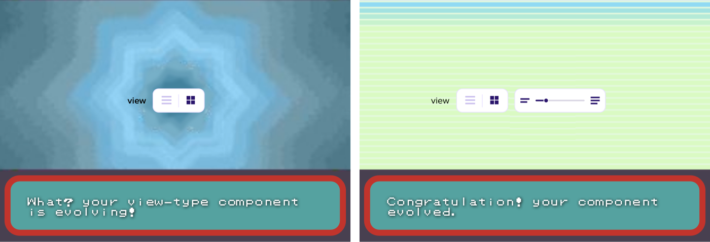
Smart adapts: Designing the Adapts is tricky; We have to think from a component level. We can design components like pokemons. Components need to be smart enough to decide based on the user model, to evolve to richer versions of themselves or to devolve.

Screens would be minimal and straightforward in the starting, and as people start using it, finer controls would surface organically. It would feel as if the UI is getting tailor-fitted to the user continuously. Based on the user profile, we can place a threshold on the cognitive load.

“Human beings, viewed as behaving systems, are quite simple. The apparent complexity of our behavior over time is largely a reflection of the complexity of the environment in which we find ourselves.” ~Herbert A. Simon
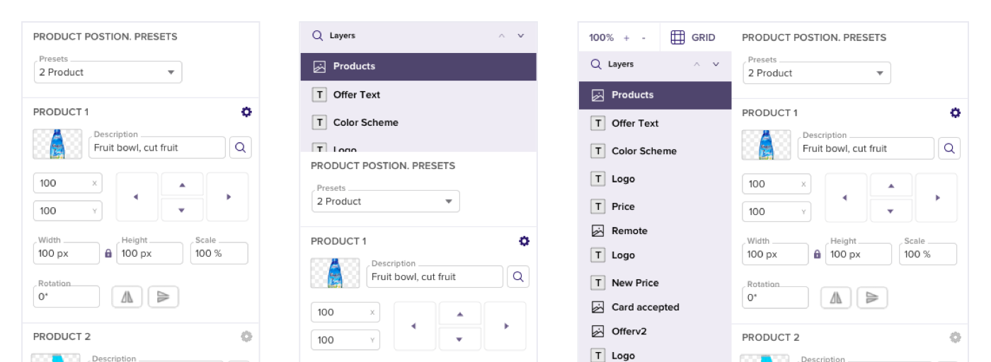
The interface adaptations need not be limited to behaviour; we could also mould it based on time, location, and other such dimensions. An interesting metric that we could take into account is the complexity of the work at hand. For example, in a file like .psd or .sketch, the number of layers could be used to infer the complexity of the project. What if the layer component morphs based on this metric.

Conclusion / TL;DR
Much like neural pathways, components that we use more should get enriched, and the ones that we don’t use much should be tapered down. UI should be ever-evolving. The products that I work with should adjust based on my work style.
Have you seen interfaces like these? What do you feel about such interfaces? Comment below and lets us have a discussion 😄

 Go to App
 Subscribe

